Go Home Efficiency & Usability
I don’t understand why you would not continue to follow web design trends that make peoples lives easier. Maybe it is because I am a web designer that I expect a website to have at least 1 of 2 functional items at the bottom of every site in this day and age. Simple, functional, useful items. Either a home page link or a return to top link so that a user can quickly return to the main navigation and/or the home page.
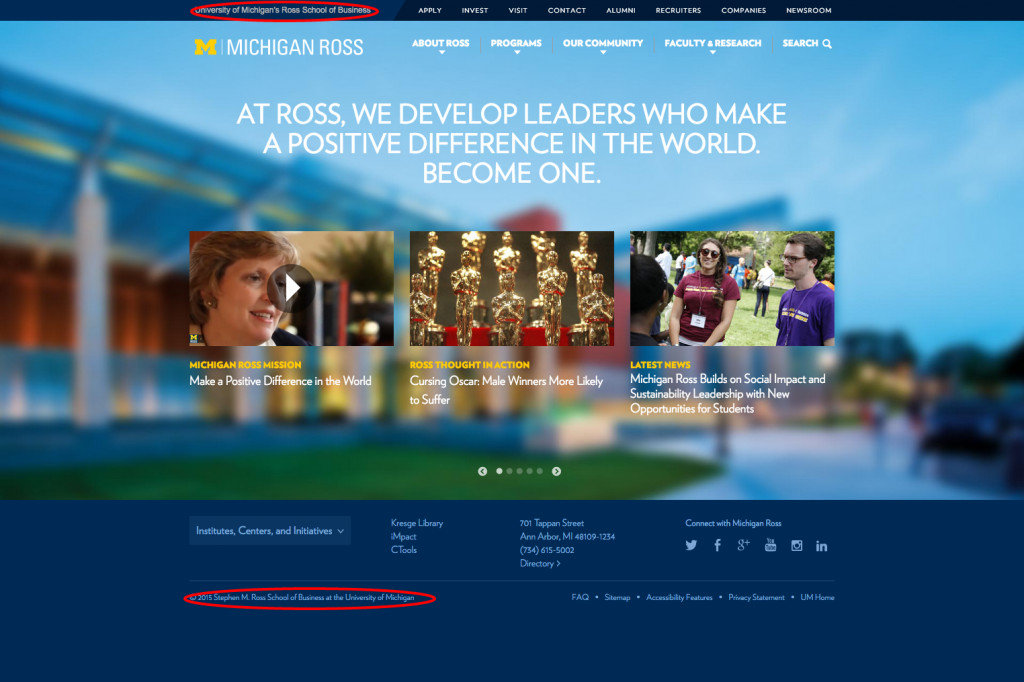
Now don’t get me wrong, the new Michigan Ross school redesign done by Behavior Design does a great job in many other areas. They keep a “sticky” top navigation to alleviate having to return to the navigation. However they miss one simple task, a home link, in that sticky top navigation or for that matter the rest of “main” links in the navigation. The links they keep in view at all times are actually secondary to the main navigation and are not even any sort of subset of the main navigation. They are a separate set of links all together. No way to quickly navigate through the main navigation nor return home. Simply, it would be easy enough to just link the title of the school which is also not available.